Identity update
In 2016 we engaged Peel Regional Council, employees, and community members in refreshing our visual identity. They expressed a strong connection to the existing visual identity and a sense of pride in the history it represented for Peel. Staying true to the existing logo, with several key updates, was the preferred option.
We released Peel Region's refreshed visual identity in 2017. With its release came the opportunity to standardize how our visual identity is used and displayed, and how it becomes the visual expression of our work. This standardization drives consistency, efficiency, and clarity in all of our communications.
Original logo - Before 2017
Refreshed logo - After 2023
Primary logos
Continuing the tradition of the original logo, the strong, stylized P is comprised of 3 distinct shapes that represent our 3 municipal partners, Brampton, Caledon and Mississauga.
The 3 segments, independent yet together, form a single harmonious entity – Peel Region.
This stylized P expresses strength in unity while visually conveying that we're better when working as one.
Logo guidelines
- Always ensure the logo is surrounded by a balanced, clear space.
- Do not force the horizontal logo into a square space.
- The logo should only appear in black or white.
- The location type will dictate which version to use.
Download
Logo versions
Logo elements
The logo should be one unit, where all 3 elements – the logomark (stylized P), the logotype, and the tagline – are cohesive.

The logomark
The logomark should always be rotated 15° counter-clockwise.
It can be used as a separate graphic to add a dynamic design element to marketing materials. These materials must also include the complete logo. For example, on a T-shirt, the stylized P could appear large on the front of the shirt if the complete logo was on the sleeve or chest
Clear space
The logo should always have a buffer of space that is free of clutter. This is called the clear space and it:
- protects the integrity of the logo.
- ensures the greatest visual impact.
- is equal to the height of the smallest element in the P design.
- applies to both versions of the logo.
No other text or graphic elements should appear within the clear space.
Logo usage
The Peel Region logo should be black or white. The white logo can appear on black or Peel blue (100C, 60M). It should not appear in blue.
The logo should always maintain a high degree of visibility. It should not be placed on busy backgrounds or images where readability is affected. The preference is for the logo to appear on white or a solid bar of black or Peel blue.
The logo version should always match the available space in which it will appear. The stacked logo should appear in a vertical space while the horizontal logo can be used in a square or horizontal space.
When in a lockup with other logos, use a version that matches the style of the others; the horizontal version goes with other horizontal logos and vice versa.
Incorrect logo usage
Do not distort the logo
Do not outline or stroke the logo with a colour
Do not use alternative fonts or colours in the logo
Do not set the logo on a background image or use a white logo on a light background
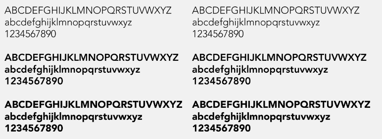
Typography
Our brand font family is Avenir LT Std. In English, Avenir means "future." That's fitting, since we're bringing our brand into tomorrow!
We chose this font family for its clean lines and accessible reading.
- The headline weight is 95 Black. The body copy weights are 45 Book or 35 Light. This mixture of weights strengthens readability.
- Set headings and larger text treatments at -20 to -25 tracking in 95 Black weight.
- Set body copy at -5 tracking with custom kerning.
- Use line breaks for a clean look and optimum readability.
Avenir LT Std
Colours
Primary
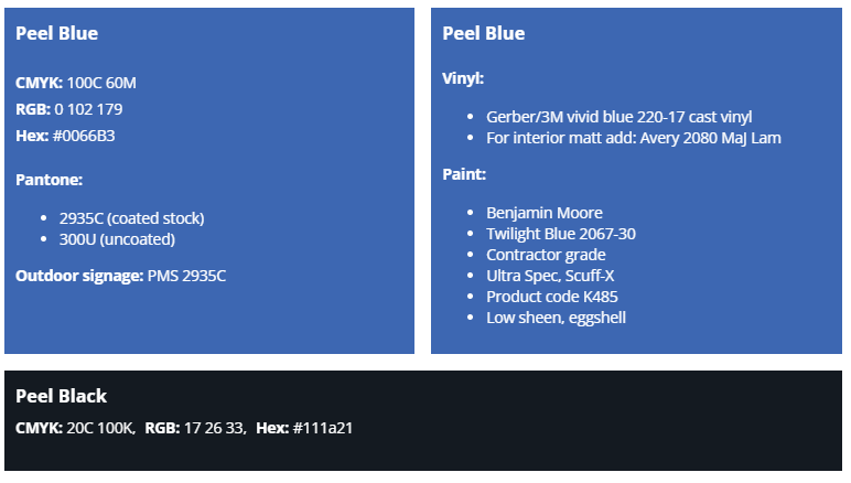
Secondary
Secondary colours are used to support the primary colours and allow for some flexibility in contrast. These colours are shades of the Peel blue and shades of grey that complement it.

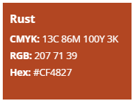
Rust
Use the highlight colour sparingly as an attention-grabbing element, such as a call to action button or the focal point of a graph.
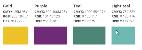
Support colours
Use of support colours should be limited. Their main purpose is for data visualization while adhering to the Peel blue, black and shades of grey for main messaging.

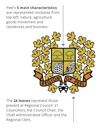
Regional Coat of Arms
The Coat of Arms is reserved for exclusive use by the Regional Chair and Council.
The bottom-left design was created in 1977. It was based upon the top-left design from the newly independent County of Peel in January 1867.
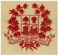
• A tree for apple orchards
• A wheat sheaf for agriculture
• A locomotive for the railroad
• A building for industry
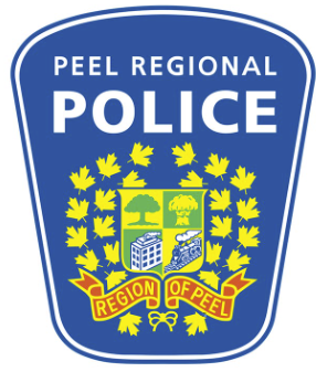
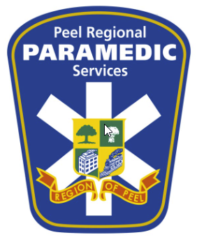
Crest applications
Peel Regional Police (PRP) and Peel Regional Paramedic Services (PRPS) crests are visible on badges, shoulder flashes, vehicles, flags, and walls.
A core part of Peel Region's image and identity, these crests reflect our municipality's history and the communities we serve.