
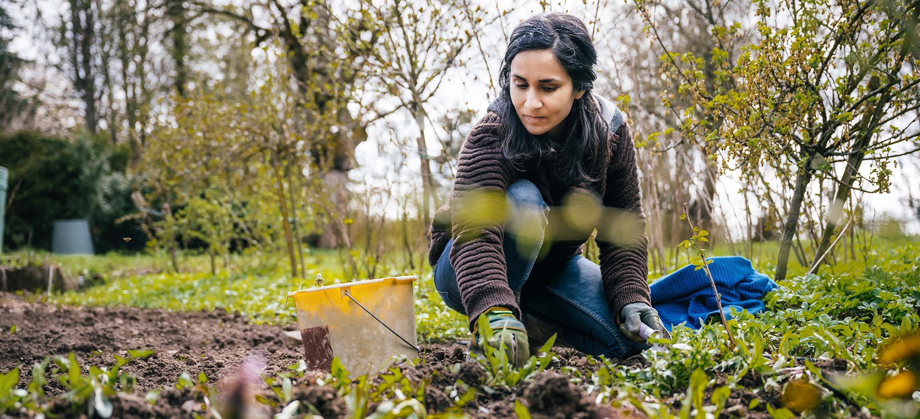
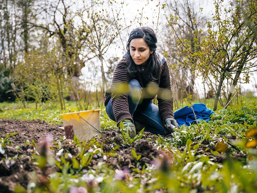
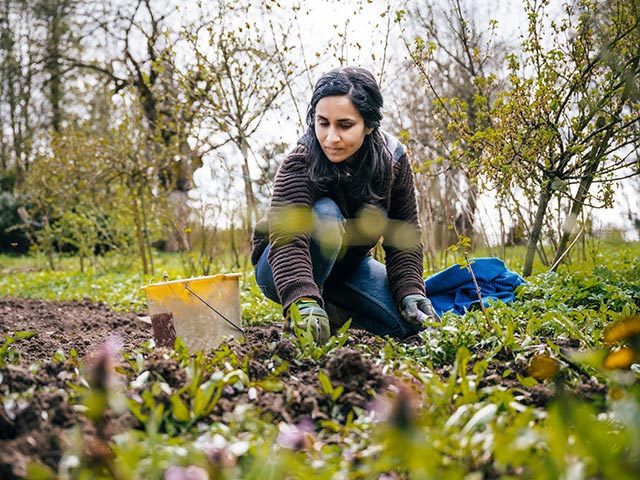
3 versions of the same image needed
Image type and optimization
The focal area/subject of the image should be in the center of the canvas (horizontaly as well as vertically) with at least 15% gutter space on all sides (this is non-focal elements ). This gives us the dead areas that can be cropped out required for responsive design. This rule may not apply on some homepage hero full-size images' canvas where we intentionally want to cut off certanin elements, as well as the fact that the space in that full resolution won't crop the image as much.
All hero images should be saved for web [in Photoshop] as JPG. Select a quality range from 50-60 to balance image size and quality.
Sample breakpoint CSS in this example
/*base code*/

.heropanel {
  position: relative;
  background-size: cover;
  background-position: center;
}
@media screen and (min-width: 1600px){
  .heropanel, .heropanel .responsive {
    height: 700px;
    position: relative;
  }
}
.heropanel, .heropanel .responsive {
  height: 600px;
  position: relative;
  overflow: hidden;
}

@media screen and (max-width: 640px) {
  .heropanel, .heropanel .responsive {
    height: 500px;
  }
}

/*image code*/

.hero_1 {
  background-image: url(/_newsite/templates/homepage/hero/hero.jpg);
  background-position: center;
}
@media screen and (max-width: 1010px) {
  .hero_1 {
    background-image: url(/_newsite/templates/homepage/hero/hero-m.jpg);
  }
}
@media screen and (max-width: 640px) {
  .hero_1 {
    background-image: url(/_newsite/templates/homepage/hero/hero-s.jpg);
  }
}


;)
;)
;)
;)
;)